Fake a mobile view on your desktop
Website population is typically done using a desktop computer, but you should check how the content looks on other devices (mobile, iPad, laptop). You can fake the likely view using the information below. Please note that it isn’t a perfect replication of the view on mobile, iPad, etc, and if your content is critical, you should check it using the actual devices.
A video that shows you how to fake a mobile view using Chrome, Firefox, and Edge:
On a Chrome browser
Chrome
If you want to use buttons to access it (this is the quickest method):
- Windows: Ctrl+Shift+i or F12
- Mac: Cmd+Opt+i
If you want to use your mouse to access it:
- Right-click on the page and choose “Inspect” from the dropdown
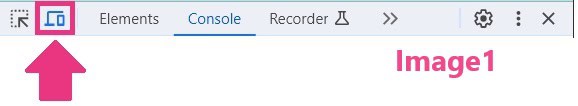
- Click the Toggle Device icon (see image 1)
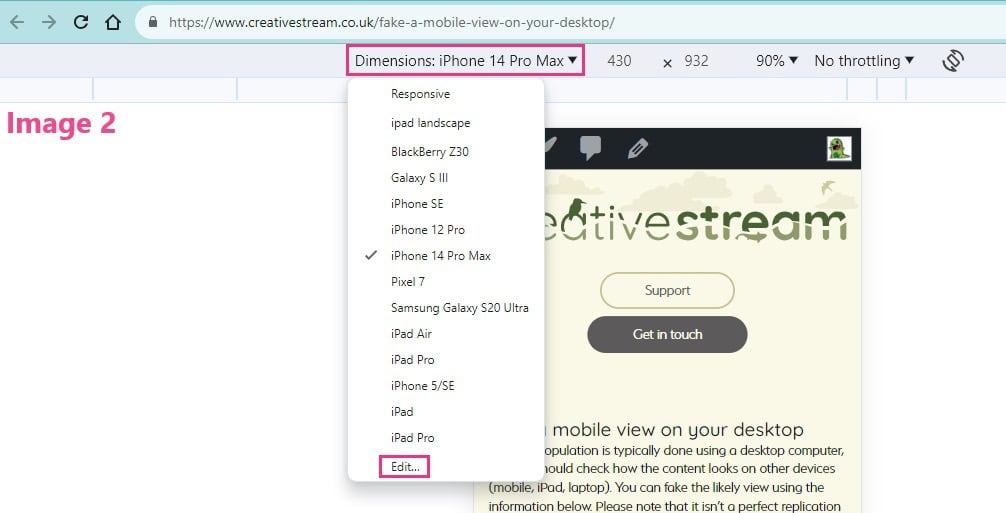
- Select the device you’d like to emulate from the dropdown just under the URL (see image 2).
- Select Edit from the dropdown to add/remove the emulated devices (see image 2)
Click on an image to open it in a new tab, slightly larger
A video that shows you how to fake a mobile view using Chrome, Firefox, and Edge:
On a Firefox browser
Firefox

If you want to use buttons to access it (this is the quickest method):
- Windows: CTRL+Shift+M
- Mac: Cmd+Opt+M
If you want to use your mouse to access it:
- Right-click on the page and choose “Inspect” from the dropdown
- Click the Responsive Design Mode icon (see images below)
- Select the device you’d like to emulate from the dropdown just under the URL.
- You may need to reload/refresh the page before the change occurs.
- Select “Edit List” to add/remove emulated devices
The Responsive Design Mode icon looks like a mobile phone and a laptop. Depending on where your ‘dock’ defaults to, it might be found at the top right of your screen, or at the bottom (see examples below). Click on the images to open them in a new tab.
Firefox browser, showing the dropdown of device choices, top left, and the Responsive Design Mode icon in the top right
Firefox browser, showing the dropdown of device choices, top left, and the Responsive Design Mode icon in the bottom right corner
A video that shows you how to fake a mobile view using Chrome, Firefox, and Edge
On a Safari browser
Safari

Informational link:
Information can be found at https://help.apple.com/simulator/mac/current/
A video that shows you how to fake a mobile view using Chrome, Firefox, and Edge:
Other pages you might find useful:
